Monitor Data Pipelines with Jupyter
Using the power of Python with Pandas and Plotly, I wanted to create a runbook to serve as a quick healthcheck every morning over coffee. The existing data pipelines were built to log key statistics on every run to audit tables. With the audit tables as a basis, I built a Jupyter notebook to monitor key stats that would normally be buried in the ETL tool’s SQLite database that was not built for analytical purposes. This allows me to slowly wakeup as I caffeinate and plan my day according to visual observations. It’s a win-win!
Setup
Connectivity
As mentioned, each pipeline logs data to audit tables that are then used to generate the desired charts. To do this, I use the Python module sqlalchemy. In this example I’m using a SQLServer database, but the module supports other engines.
1
2
3
4
5
6
7
8
9
10
11
import pandas as pd
from sqlalchemy import create_engine
import datetime as dt
import plotly.express as px

#connect via trusted auth
engine = create_engine(
    'mssql+pyodbc://'
    '@RPCMPDB01/cdp?'
    'driver=ODBC+Driver+17+for+SQL+Server'
    )
Data
With the connection defined, I’m now free to populate my Panda dataframes.
1
2
3
4
5
6
7
8
9
10
11
12
13
14
15
16
17
#load dataframes
df_audit = pd.read_sql(sql=auto_log, con=engine, index_col=['automation_name'], parse_dates=['start_date','end_date'])

#set data types and add calculated fields
df_audit['feed_instance_id'] = df_audit['feed_instance_id'].astype('string')
df_audit['total_elapse_secs'] = (df_audit['end_date'] - df_audit['start_date']).astype('timedelta64[s]').fillna(0)
df_audit['run_date'] = df_audit['start_date'].astype('datetime64[D]')
df_audit = df_audit.set_index(['run_date'], append=True)

df_audit_agg = df_audit.groupby(['automation_name','run_date'])['total_elapse_secs'].mean()
df_audit = df_audit.join(df_audit_agg, rsuffix='_mean')
df_audit = df_audit.fillna(value={'feed_instance_id':'1'})
df_audit_agg = df_audit.groupby(['automation_name','run_date'])['feed_instance_id'].count().fillna(1)
df_audit = df_audit.join(df_audit_agg, rsuffix='_count')

#filter out incomplete runs
df = df_audit[df_audit.end_date.notnull()].reset_index()
Plotly Gantt
My first exposure to Gantt charts was limited to waterfall project methodologies. In this use case, I’m able to draw a graphical representation to quickly inform me of:
- missed data pipeline runs
- anomalies in typical run times as runtimes are depicted by width
Below is an example of this in practice:
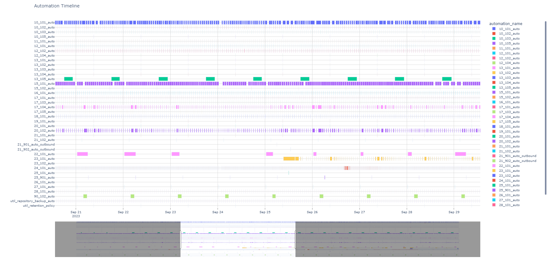
Note how you can determine:
22_101_auto(indicated in pink) failed to execute on 9/2423_101_auto(indicated in yellow) recently came on-line on 9/2517_104_autoand20_102_autohave occassional spikes in runtimes (indicated by width) and that those can be safely be ignored based on historical trends
The above was created using the following:
1
2
3
4
5
6
7
8
9
10
#form timeline based on dataframes
fig1 = px.timeline(df, x_start='start_date', x_end='end_date', y='automation_name', hover_data=['automation_name','total_elapse_secs','total_elapse_secs_mean','has_error'], color='automation_name', title='Automation Timeline')
fig1.update_layout(autosize=False, width=2100, height=1100, plot_bgcolor='white')
fig1.update_yaxes(title=None, gridcolor='lightgrey')

dt_now = dt.datetime.now()
init_range = [ (dt_now - dt.timedelta(days=8)).strftime('%Y-%m-%d'), (dt_now + dt.timedelta(days=1)).strftime('%Y-%m-%d')]

fig1.update_xaxes(ticks='outside',gridcolor='lightgrey',rangeslider_visible=True, range=init_range)
fig1.show()
Plotly Box
When an abnormal runtime is noticed, it helps to know if the time is within a normal range. A box chart may be used to address this scenario.
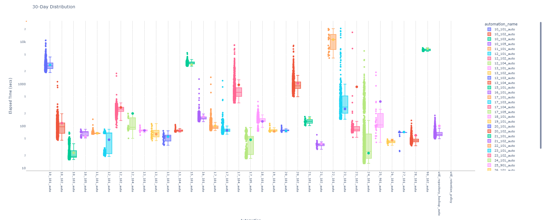
In this chart, I’m using a logarithmic scale to account for differing runtimes as some pipelines are more computational intensive. Each automation’s runtime is depicted based on its quartile distribution. Per Plotly’s documentation:
The ends of the box represent the lower and upper quartiles, while the median (second quartile) is marked by a line inside the box.
I’ve also added some additional graphical overlays to provide additional context.
- Scatter plots for each run in the 30-day window are injected alongside each box to help visualize the runtime distribution
- Additional trace is added, indicated by a different color dot within a distribution box, that indicates the today’s average. This allows one to quickly discern whether today’s run was on the lower-end (e.g.
24_101_auto) or on the higher-end (e.g.17_104_auto). The later may be worthy of additional investigation.
The above was created using the following:
1
2
3
4
5
6
7
8
9
10
11
12
13
14
15
16
17
18
19
min_cutoff = 600
prior_30_days = today - dt.timedelta(days=30)

long_auto = df_today.index.values

df_box_stats = df[(df['start_date'] >= pd.to_datetime(prior_30_days.strftime('%Y-%m-%d'))) & (df['automation_name'].isin(long_auto))]

fig_box = px.box(df_box_stats, x='automation_name', y='total_elapse_secs', points='all', color='automation_name', hover_data=['start_date'], title='30-Day Distribution', log_y=True)
fig_box.update_yaxes(rangemode="tozero", title='Elapsed Time (secs)', showgrid=True)
fig_box.update_xaxes(title='Automation', tickangle=90, showline=True, linewidth=1, linecolor='grey', showgrid=True, gridwidth=1, gridcolor='lightgrey')
fig_box.update_layout(autosize=False, width=2100, height=900, plot_bgcolor='white')

import plotly.graph_objects as go
for auto_name in long_auto:
  y_val = df_today.loc[auto_name].loc['Current Elapse Mean']
  if y_val == None:
    y_val = 0
  fig_box.add_trace(go.Scatter(x=[auto_name], y=[y_val], mode='markers',marker_symbol = 'circle-dot', marker_size=10, showlegend=False))
fig_box.show()